i really like the one between the bars and steal your face. THAT is getting close to logo worthy IMHO.


You are using an out of date browser. It may not display this or other websites correctly.
You should upgrade or use an alternative browser.
You should upgrade or use an alternative browser.
MTBNJ Sticker Design Contest
- Thread starter Norm
- Start date
mwlikesbikes
Well-Known Member
Up to this point I never knew that hippie dead logo was called steal your face. (I'm 41 btw) That's what I get for being a good teenage metalhead 😀 That would mean that I vote no on that one.
I like the cog design, maybe change the lettering style to what's on the site logo.
Edit: I like the one first in line as well as the one shown on the t-shirt too.
I like the cog design, maybe change the lettering style to what's on the site logo.
Edit: I like the one first in line as well as the one shown on the t-shirt too.
Last edited:
Stocky
Member
Being a Dead fan I'd like to see the Steel Your Face fine tuned and the bottom words changed , trying to think to what .
The first logo on the t-shirt looks really nice , but the cleanest most professional in my opinion is the cog one with " your guide to the rock garden state" on the top and "supported by your friends at Halters cycles" on the bottom.
I'm surprised nobody went with the Pam Anderson analogy .
The first logo on the t-shirt looks really nice , but the cleanest most professional in my opinion is the cog one with " your guide to the rock garden state" on the top and "supported by your friends at Halters cycles" on the bottom.
I'm surprised nobody went with the Pam Anderson analogy .

Dr Superb
Active Member
there are too many good ones to choose from... I'd rock any of them to be honest...
Same here. They are all really good. even the Dead / Phish ones...
pinkshirtphotos
Active Member
Idea for those with drawing skills. The jersey devil beasting a 29er ss.
starflyr
Member
Holy crap, I go on an 8 hour car ride and this is what I miss?
So Anyway, I made this one for Utah and Luke.
thats f_kin sweet!!
Holy crap, I go on an 8 hour car ride and this is what I miss?
So Anyway, I made this one for Utah and Luke.
Ahhhhh, nooooooooo!
RNG1
Well-Known Member
Zoller, if u want we can team up and use that idea with an idea capers and I had. Capers take a memo: let's have the lady stick figure that is chasing the baby wear a sombrero and let's have that diaper she is holding have that grateful dead sticker idea on the back of the diaper. There is a lot going on with this idea now, this may work better as a t shirt.

Ok, back on topic. We would like to thank everyone who participated in the contest. We had a bunch of solid designs and we did discuss quite a bit. After some discussion we agreed to go with the Capers/RNG1 idea as the winner. The cog was a solid design, and could easily be considered the best. But for our purposes we liked the larger/clearer version that ended up winning.
We have decided to not change the site/team logo, and to just use this as a sticker and possibly a t-shirt for now.
Thanks to all for the efforts!
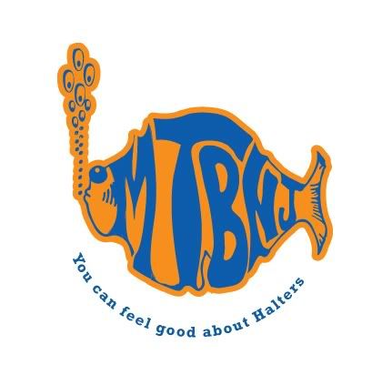
The Winner

Second Place

We have decided to not change the site/team logo, and to just use this as a sticker and possibly a t-shirt for now.
Thanks to all for the efforts!
The Winner
Second Place